The other important aspect of Stance is making
sure that your poses "Read" easily. While this is a simple concept,
it can be somewhat difficult to explain. The basic concept is as follows:
the audience is motivated by their desire to understand what is happening
in your animation. They will continue to be entranced as long as
they are actually able to understand what is happening. If, however,
they are at some point unable to understand the basic motions happening
in front of them, they will rapidly lose interest.
A pose "Reads" correctly only if the audience, looking at it, can tell
at a glance what the entire physical position of the character is.
Even better, of course, is if the pose puts across a strong sense of motion
or anticipation, so that the audience is cued to understand the next frame
of the animation even before they see it.
How well a pose reads is often measured by how well its silhouette reads.
In general, the only thing that the audience is guaranteed to perceive
is the silhouette of the character. You can hope that they will pick
up on more subtle visual cues, but you can't count on it. Honestly,
even if they do pick up on subtle visual cues, these will be reinforced
by a good silhouette on your image.
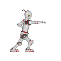
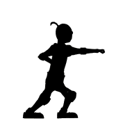 A
strong silhouette will make everything important about the action clear.
It will show the positions of all four limbs, the way that the character
is bearing their weight, and the general focus of the character's attention.
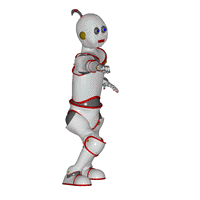
 A
bad silhouette will obscure as much as possible. It will cover the
positions of the limbs, or make it impossible to tell (by silhouette) which
limb is which. It will hide the way the character is bearing their
weight, and make the focus of attention a mystery. A really truly
bad silhouette can reduce a well-modelled character into a featureless
blob of color and lines.
How well a pose "reads" depends not only on the pose, but on the angle
of the camera, other characters, the color of the background, the nature
of the lighting, and probably other factors that I haven't even thought
of. You should try to keep all of these things in mind... of course,
you probably won't. Certainly I never do. But the more you can be
concerned with giving your character every chance to shine, the better
your animations will be.
Next Page
Previous Page
Back to Dojo

 A
strong silhouette will make everything important about the action clear.
It will show the positions of all four limbs, the way that the character
is bearing their weight, and the general focus of the character's attention.

 A
bad silhouette will obscure as much as possible. It will cover the
positions of the limbs, or make it impossible to tell (by silhouette) which
limb is which. It will hide the way the character is bearing their
weight, and make the focus of attention a mystery. A really truly
bad silhouette can reduce a well-modelled character into a featureless
blob of color and lines.